Kužina
Visual identity for a homemade fast food restaurant, built around a warm retro aesthetic, bold character, and a sense of familiar everyday comfort.
Services: visual identity / logo design / signage / menu design / packaging / interior posters / staff apparel
PROJECT OVERVIEW
Kužina is a homemade fast food restaurant with a strong focus on approachable, comforting food served in a casual and familiar environment. The project included the development of a complete visual identity — from the logo and exterior signage to menus, placemats, takeaway packaging, drink cups, interior posters, and employee T-shirts.
The goal was to create a brand that feels warm, memorable, and full of character, while still being practical and easy to apply across different touchpoints. Instead of following a generic fast food visual language, the identity was designed to feel closer to a local kitchen — expressive, inviting, and slightly nostalgic.
The retro-inspired style became the foundation of the brand. Rounded shapes, warm colours, bold typography, and playful graphic patterns helped create an identity that feels casual and friendly, but also visually distinctive and consistent.
CHALLENGE
The main challenge was to create an identity that communicates speed and accessibility without losing the feeling of homemade food. Kužina needed to feel simple, direct, and easy to recognize, but not cold, overly commercial, or generic.
Fast food branding often relies on loud colours, standardised layouts, and predictable visual codes. For Kužina, the task was to move away from that expected look and build a visual language with more warmth, personality, and local charm. The identity needed to suggest comfort, flavour, and everyday familiarity — while still working clearly on signage, menus, packaging, and other practical restaurant materials.
Another important challenge was maintaining balance between the retro character and contemporary usability. The brand had to feel nostalgic and expressive, but not outdated. Every element needed to support a cohesive system that could work across the physical space, printed materials, takeaway items, and staff clothing.
The concept behind Kužina was built around the idea of a warm, familiar kitchen — a place where food is simple, comforting, and made with character. Instead of creating a visual identity that feels like a typical fast food brand, the goal was to give Kužina a more personal and nostalgic expression, closer to the feeling of homemade food and everyday local dining.
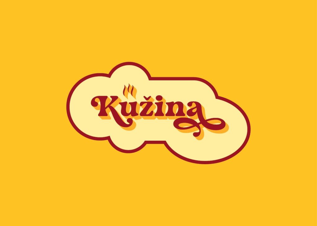
The retro direction became a natural fit for that idea. The logo combines expressive typography with a soft, cloud-like frame that suggests warmth, steam, and the atmosphere of a busy kitchen. The small steam detail adds a direct culinary association, while the custom letterforms give the brand a friendly, memorable, and slightly playful personality.
The visual language was designed to feel bold and instantly recognizable, but not aggressive. Warm yellow tones, deep red accents, rounded shapes, and simple patterns create a sense of familiarity and appetite, while also giving the identity enough visual energy to work across menus, packaging, signage, and interior graphics.
Overall, the concept balances three key qualities: the speed and simplicity of fast food, the warmth of homemade cooking, and the charm of a retro-inspired local restaurant.
The visual identity system for Kužina was designed to be warm, bold, and immediately recognizable, with a retro-inspired logo as its central element. Expressive lettering, a soft rounded frame, deep red typography, warm yellow tones, and subtle orange shadowing create a distinctive identity that feels friendly, nostalgic, and full of character. The small steam detail adds a simple culinary cue, reinforcing the idea of freshly prepared homemade food.
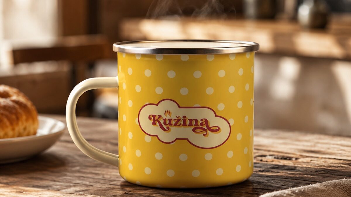
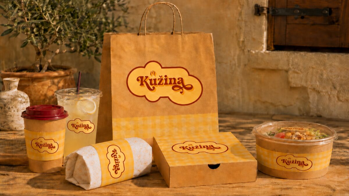
The colour palette is intentionally warm and appetite-driven. Yellow, cream, red, and orange create a sense of comfort, warmth, and familiarity, while also giving the brand enough visual strength to stand out in a busy restaurant environment. These colours work across large surfaces such as signage and wall posters, as well as smaller details like packaging labels, cups, menus, and staff uniforms.
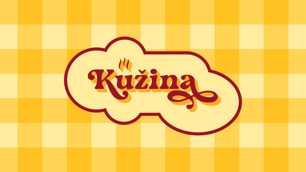
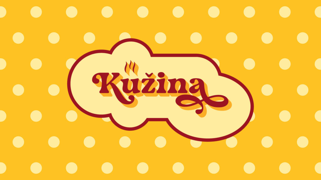
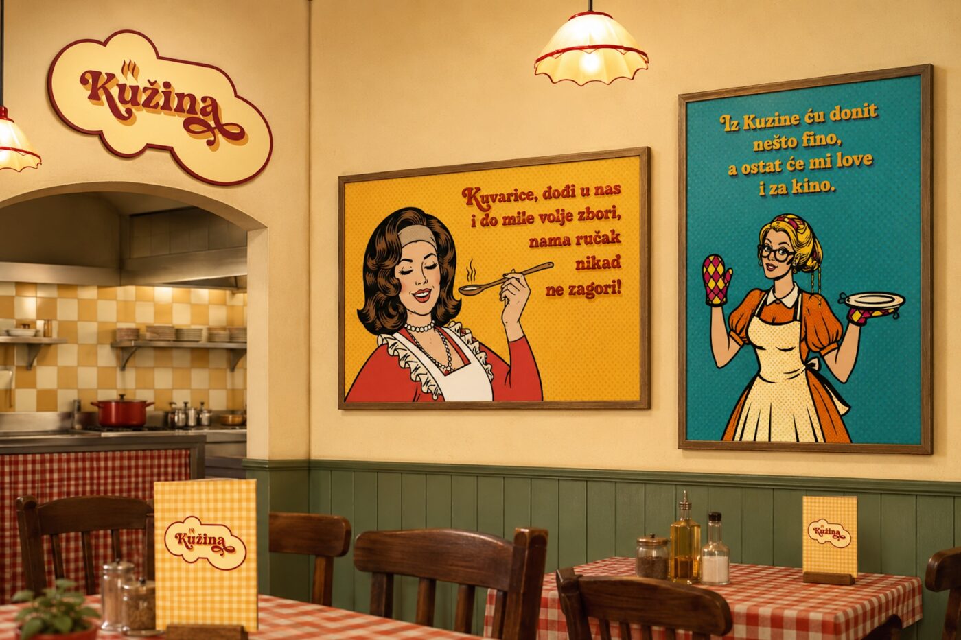
Patterns play an important role in extending the identity beyond the logo. The checkered pattern brings in a classic diner-inspired feeling, while the dotted pattern adds a softer and more playful rhythm. Together, they create a recognizable visual backdrop that supports the retro atmosphere without making the system feel overly decorative.
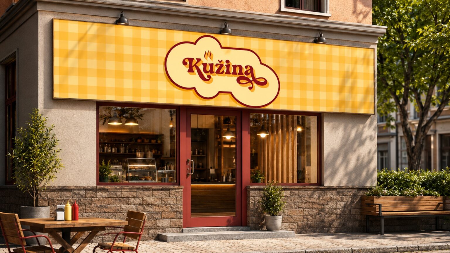
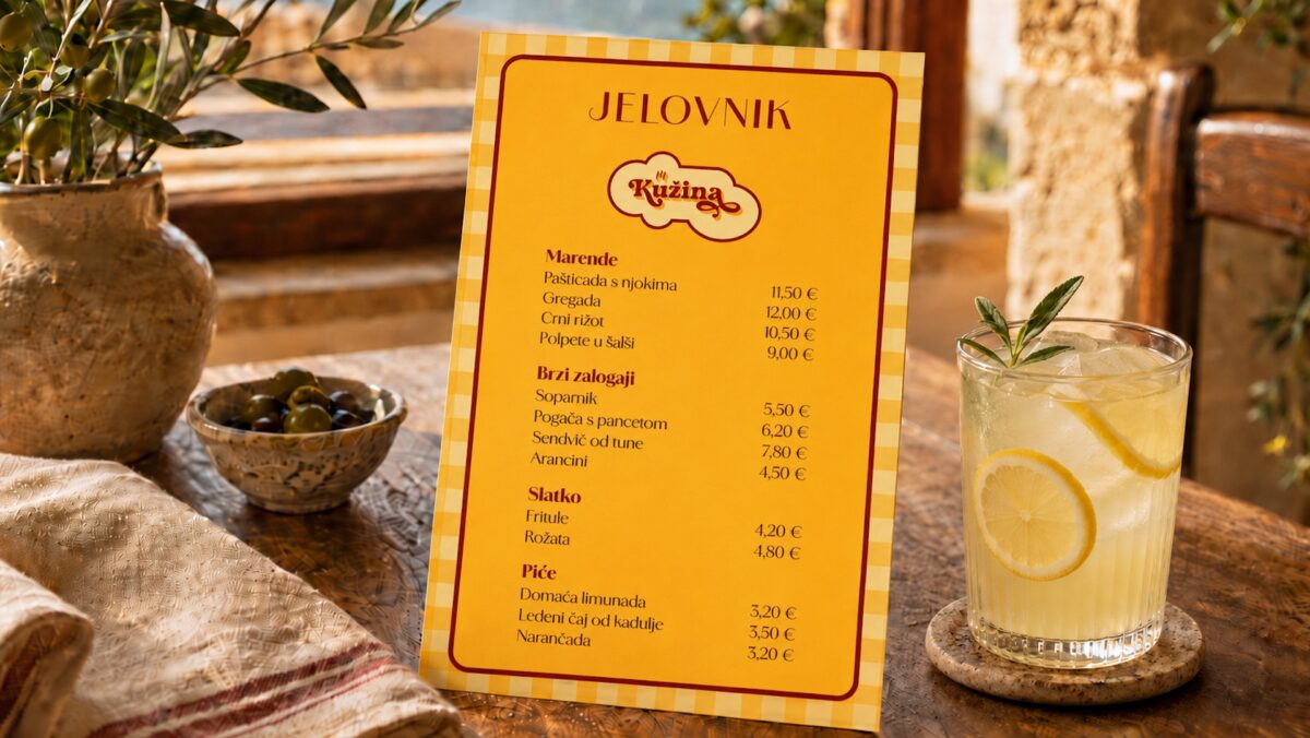
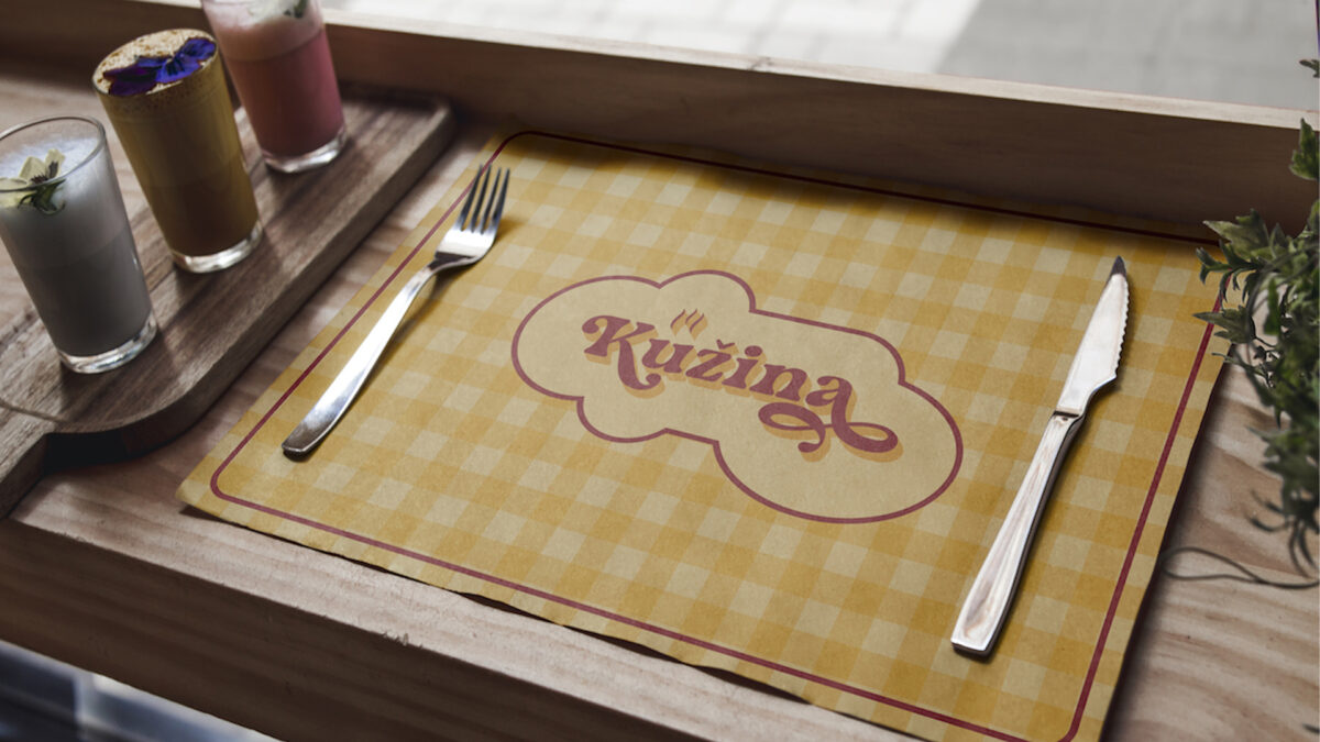
The visual identity was applied across a full set of restaurant touchpoints, creating a consistent experience from the street to the table. The exterior signage uses the logo and checkered pattern as a strong visual anchor, giving the restaurant a warm, recognizable presence before guests even enter the space. Inside, the same retro language continues through wall graphics, posters, menus, and placemats, helping shape an atmosphere that feels casual, nostalgic, and closely connected to the idea of homemade food.
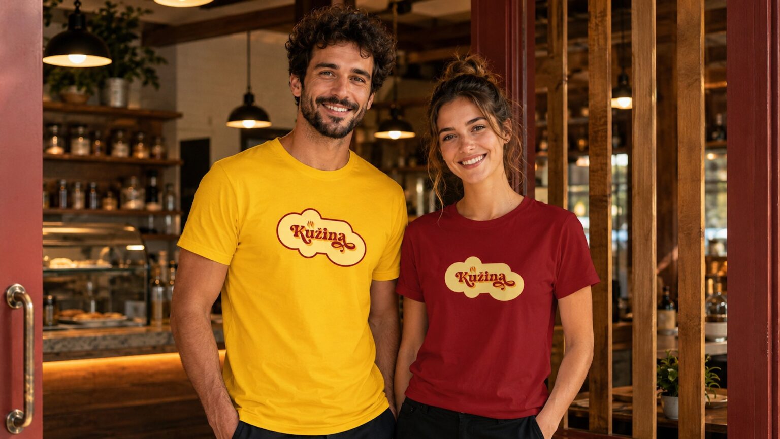
The system was also extended to takeaway packaging and everyday service items, including paper bags, food boxes, wraps, cups, drink containers, and staff T-shirts. These applications use the logo, colour palette, and patterns in a simple but distinctive way, making the brand visible in both dine-in and takeaway contexts. The result is a practical identity system that can support daily restaurant operations while still feeling visually cohesive and memorable.
The visual identity was applied across a full set of restaurant touchpoints, creating a consistent experience from the street to the table. The exterior signage uses the logo and checkered pattern as a strong visual anchor, giving the restaurant a warm, recognizable presence before guests even enter the space. Inside, the same retro language continues through wall graphics, posters, menus, and placemats, helping shape an atmosphere that feels casual, nostalgic, and closely connected to the idea of homemade food.
The system was also extended to takeaway packaging and everyday service items, including paper bags, food boxes, wraps, cups, drink containers, and staff T-shirts. These applications use the logo, colour palette, and patterns in a simple but distinctive way, making the brand visible in both dine-in and takeaway contexts. The result is a practical identity system that can support daily restaurant operations while still feeling visually cohesive and memorable.
OUTCOME
The final identity gives Kužina a clear and recognizable brand presence with a strong retro character. It moves away from generic fast food aesthetics and creates a warmer, more personal visual world — one that feels approachable, local, and full of flavour.
By connecting the logo, signage, menus, packaging, interior graphics, and staff apparel into one consistent system, the brand gains a complete visual language that works across every customer touchpoint. The outcome is an identity that supports both the restaurant’s everyday functionality and its overall atmosphere: friendly, nostalgic, homemade, and easy to remember.