Otto Monti
Visual identity for a travel agency inspired by landscape, orientation, and the experience of arrival.
Services: brand identity / logo design / business cards / stationery / wall decal / vehicle graphics
PROJECT OVERVIEW
Otto Monti is a visual identity project developed for a travel agency looking for a brand presence with a clearer sense of character and place. One of the key starting points came directly from the client: the logo needed to include a specific mountain, giving the identity a visual reference that was both personal and immediately recognisable.
The project focused on translating that request into something refined and usable. Rather than building the identity around a literal scenic image, the direction moved toward a more reduced and deliberate visual language, allowing the mountain to become a strong brand element, and not just a descriptive motif.
CHALLENGE
The challenge was to create a travel identity that felt distinctive without relying on familiar industry clichés. It needed to suggest destination, movement, and atmosphere, but in a way that remained clear, composed, and professional.
At the same time, the mountain could not feel like an added detail. It had to sit at the centre of the identity in a way that felt fully integrated, giving the brand a recognisable core while still allowing the system to work smoothly across different applications.
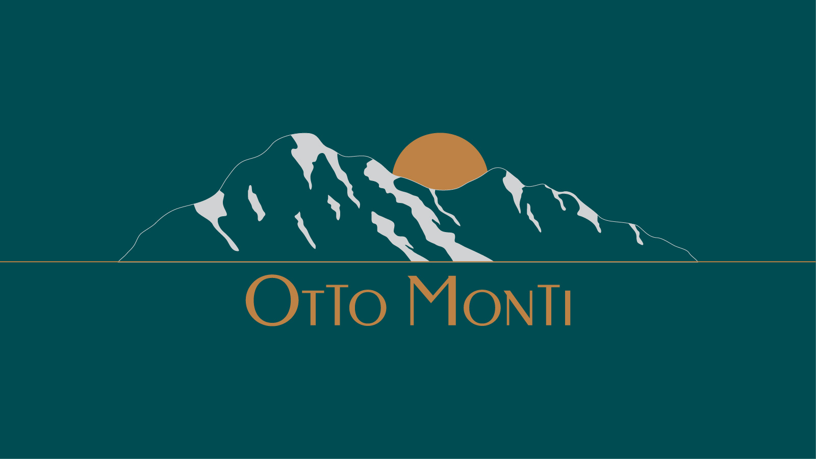
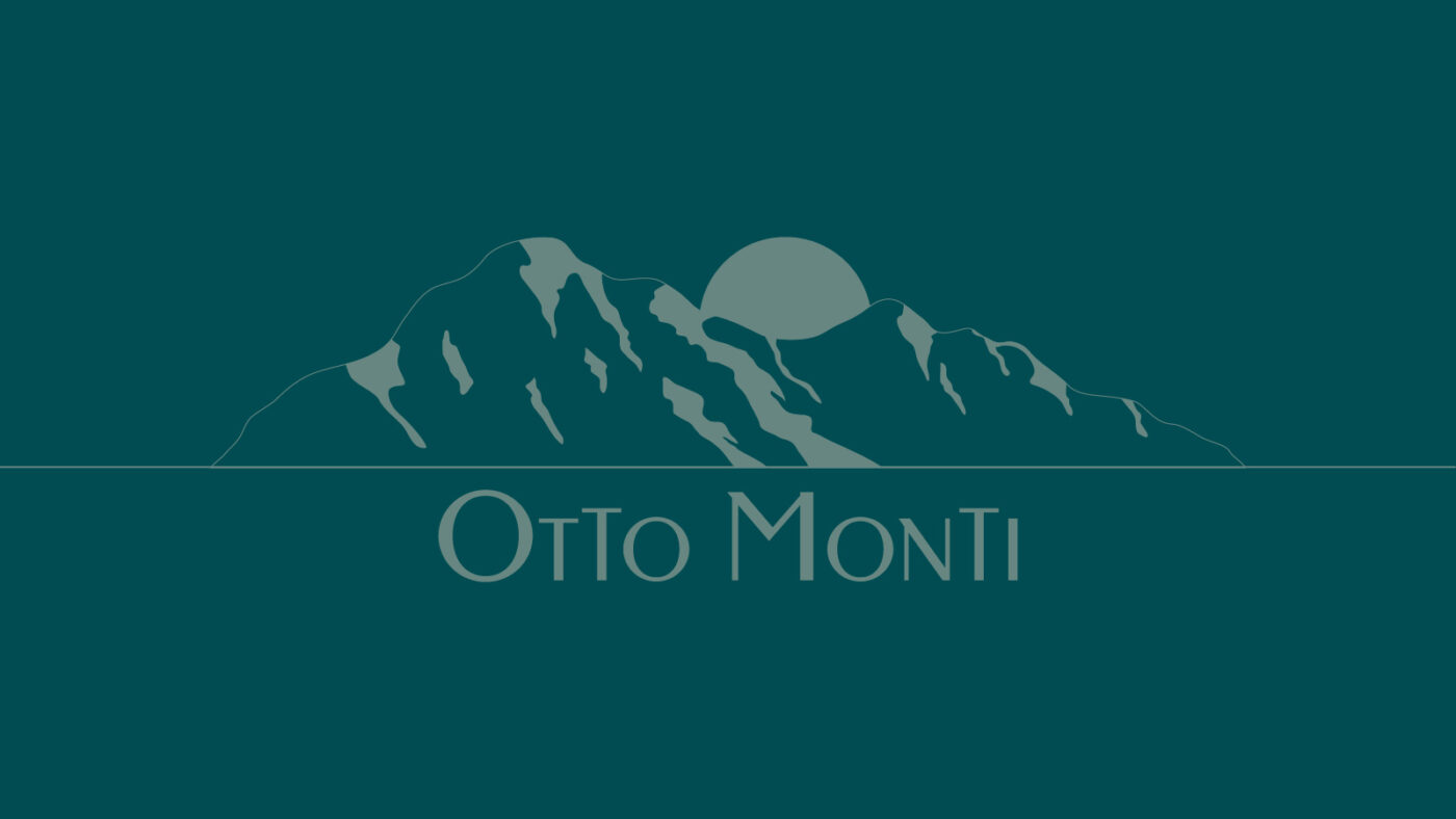
The concept grew from the mountain silhouette itself. By simplifying its form and pairing it with a sun element, the logo takes on a sense of orientation and place without becoming overly illustrative.
That balance was essential to the project. The mark keeps its connection to a real landscape, but it does so through a restrained and memorable form. As a result, the identity carries a sense of travel and arrival in a way that feels calm, distinctive, and visually grounded.
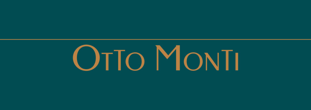

The visual identity system builds on that same sense of clarity. The logo acts as the defining feature, while the supporting elements were kept focused to give the brand a consistent and recognisable presence across every touchpoint.
The palette of green, warm orange, and white brings freshness, contrast, and warmth to the system. Combined with clean typography and a simple compositional structure, these elements help the identity feel approachable, confident, and easy to carry across print, signage, and vehicle applications.
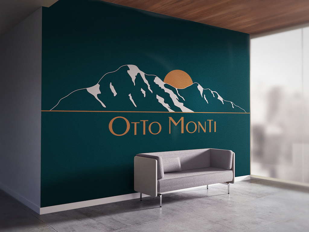
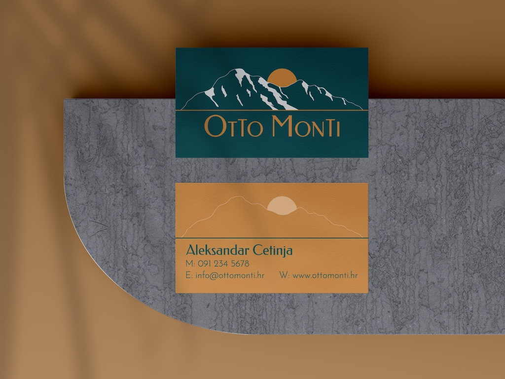
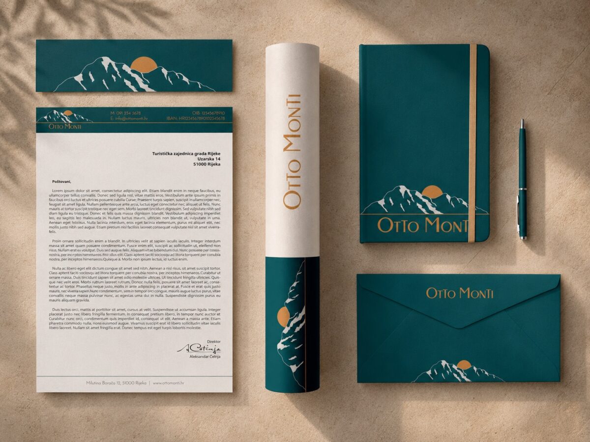
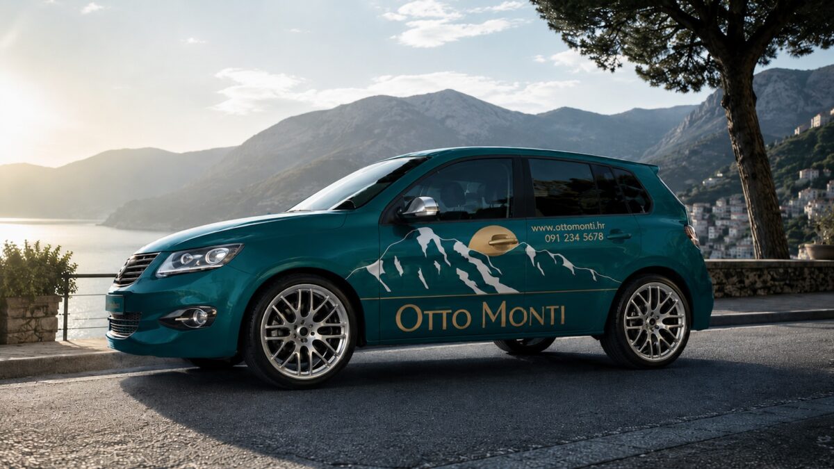
Once the core direction was established, the identity was extended into a set of practical brand applications including business cards, stationery, a wall decal, and vehicle graphics.
Each piece was designed to support the same visual language, so the brand would feel coherent wherever it appears. This helped turn the logo into a fuller identity system, one that works consistently across both stationary and environmental formats.
OUTCOME
The final result is a visual identity that gives Otto Monti a stronger and more recognisable presence. By building the brand around a meaningful visual reference, the project creates a sense of distinction that feels more specific and memorable than a generic travel mark.
The system is simple, adaptable, and cohesive throughout. It presents the brand in a way that feels clear and established, while still retaining a visual sense of place, movement, and character.