Špenko knitwear
Logo redesign for a knitwear brand, bringing a more professional, crafted, and timeless expression to an established visual identity.
Services: logo redesign / visual identity refinement / logomark design / typography / color palette.
PROJECT OVERVIEW
Pletenine Špenko is a Slovenian knitwear brand focused on knitted garments and textile products. The project centered primarily on redesigning the brand’s logo — moving away from a visually outdated mark toward a more refined identity that better reflects the quality, craft, and tradition behind the products.
The goal was not to completely detach the brand from its roots, but to reinterpret its visual presence in a more professional and contemporary way. The new identity needed to feel warm, tactile, and connected to the world of knitwear, while still being clear, practical, and adaptable across different brand applications.
CHALLENGE
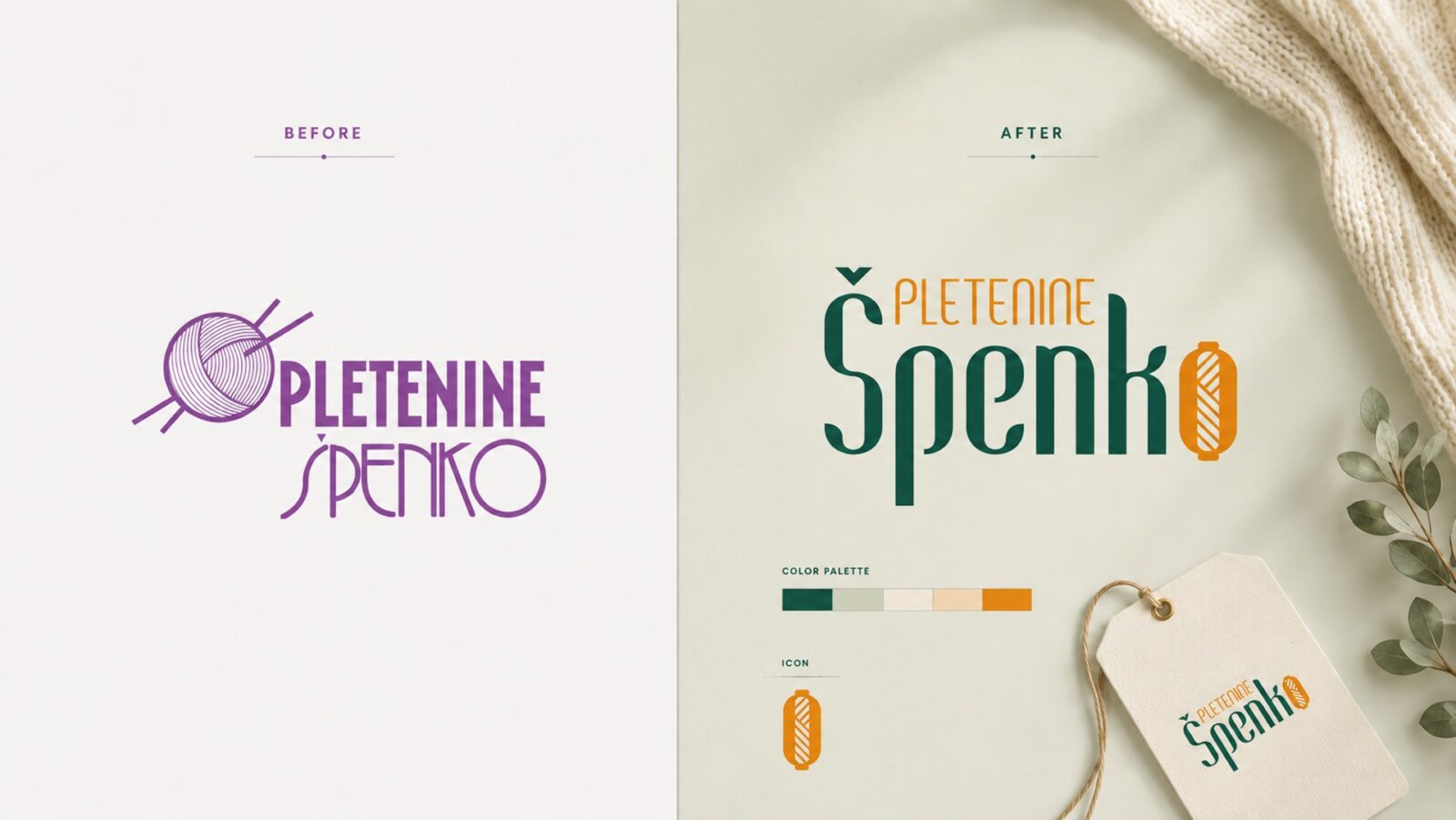
The original logo had recognizable thematic elements, but its overall execution felt visually unbalanced and less professional than the brand itself. The typography, yarn illustration, and composition gave the impression of a handmade or hobby-level identity rather than an established knitwear brand.
The challenge was to preserve a sense of craft, tradition, and familiarity without allowing the redesign to feel old-fashioned or overly decorative. The logo needed to carry a subtle vintage character, but in a cleaner and more controlled visual language — one that could work equally well on labels, packaging, digital materials, and brand communication.
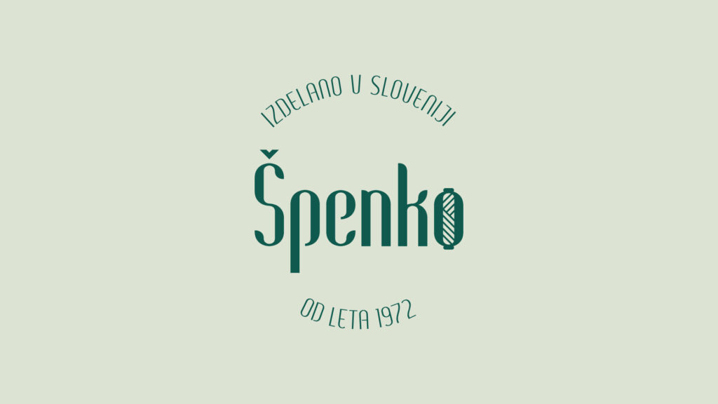
The concept was built around the idea of combining textile craft with a more elegant, heritage-inspired visual tone. A distinctive serif-style typeface was chosen to introduce a slightly old-world, traditional feeling, while the overall composition was simplified and refined to make the brand appear more confident and professional.
The letter “O” was transformed into a stylized ball of yarn, with thread-like lines referencing the material and process behind the brand. This element gives the logo a direct connection to knitting and textile production, but also adds a memorable visual detail that can stand on its own as a separate logomark.
By turning a functional letter into a symbolic brand element, the identity becomes more ownable — not just a wordmark, but a visual system with a clear craft-based reference.
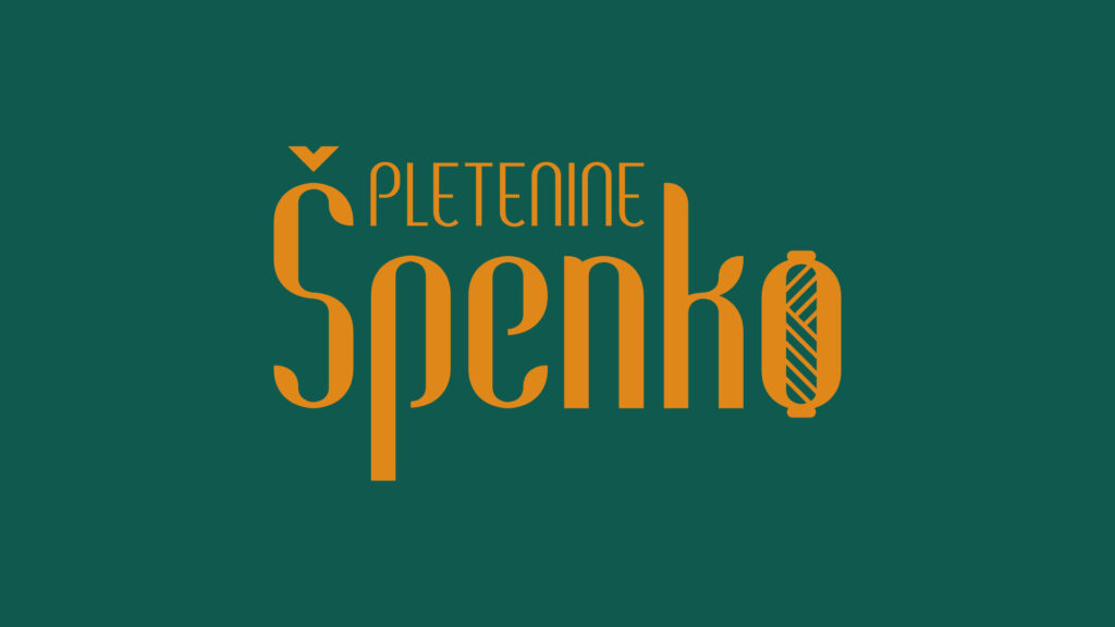
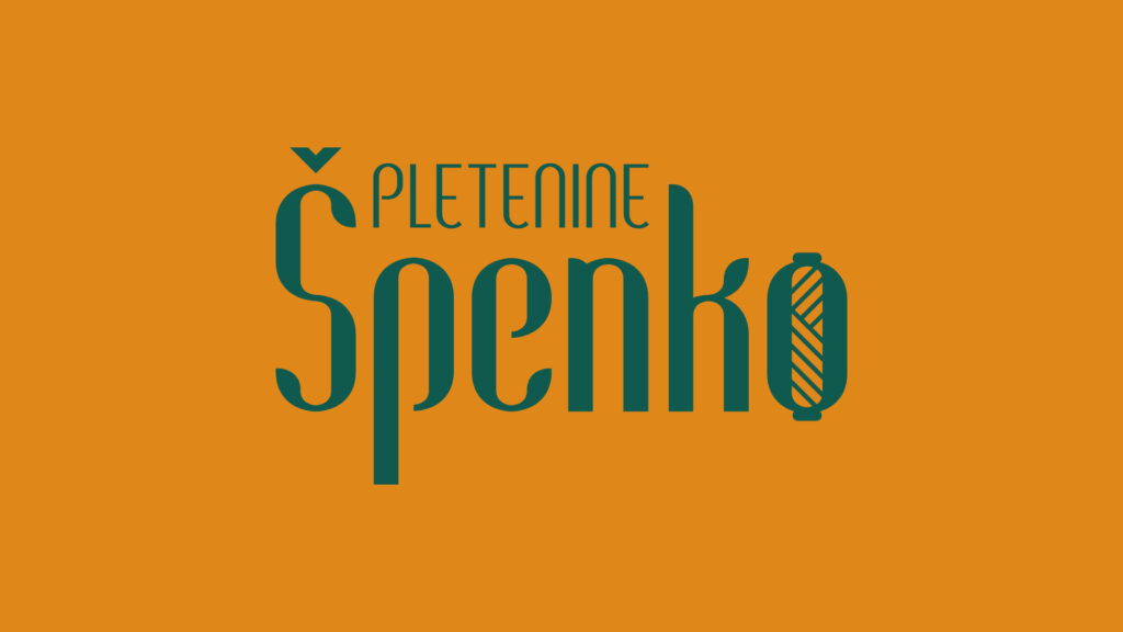
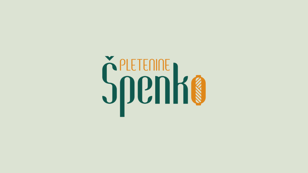
The redesigned logo introduces a more structured and flexible identity system. The main wordmark combines expressive typography with a simplified yarn-inspired symbol, creating a balance between vintage character and modern usability. The result is more refined than the original logo, while still maintaining warmth and a handmade sensibility.
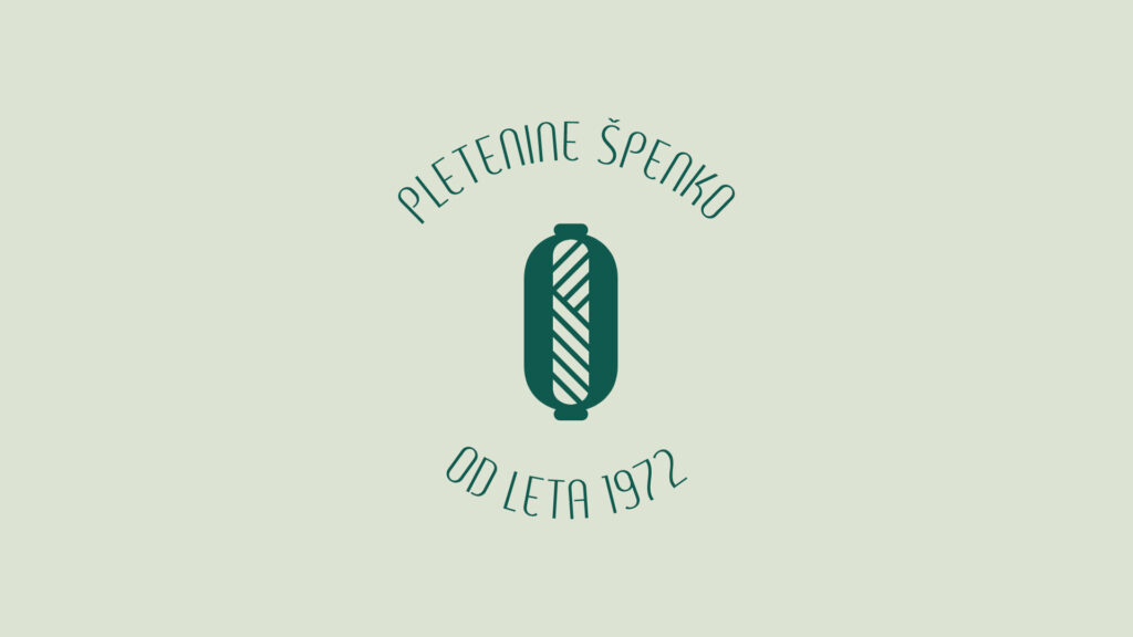
Several logo versions were developed to support different uses: a primary lockup with the full name, a simplified version, monochrome alternatives, and a standalone icon based on the yarn motif. This allows the brand to remain recognizable across both larger brand moments and smaller applications where the full logo may not be practical.
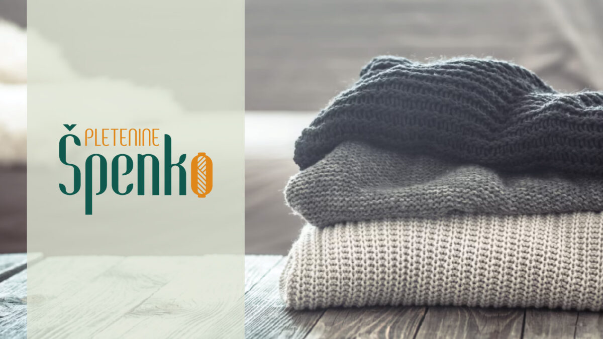
The color palette was also adjusted to better reflect the nature of the products. Instead of relying on a single bright tone, the new palette uses softer, more grounded shades — with deep green, warm orange, muted neutrals, and pastel-inspired variations. These colors create a warmer and more natural atmosphere, supporting the textile quality of the brand and giving the identity a more mature, product-oriented feel.
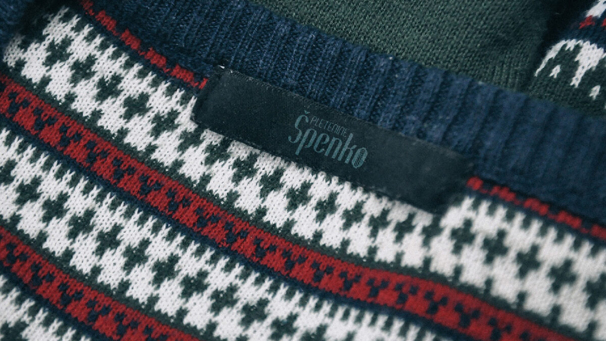
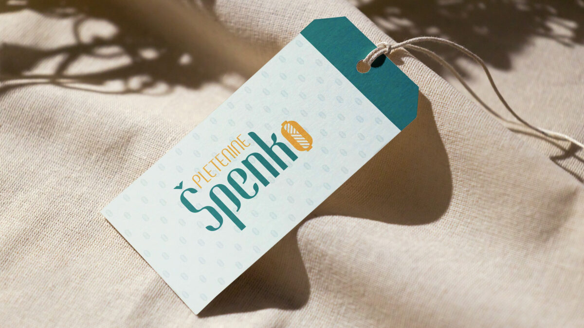
The redesigned identity was extended across a focused set of brand applications connected to product presentation, customer experience, and digital communication. On clothing labels and apparel tags, the new logo gives the brand a more crafted and professional presence, while the yarn-inspired logomark works as a small but recognizable detail. The tag system combines the full logo, subtle pattern, warm paper textures, and heritage messaging such as “Since 1972”, helping connect the products with the brand’s long-standing tradition.
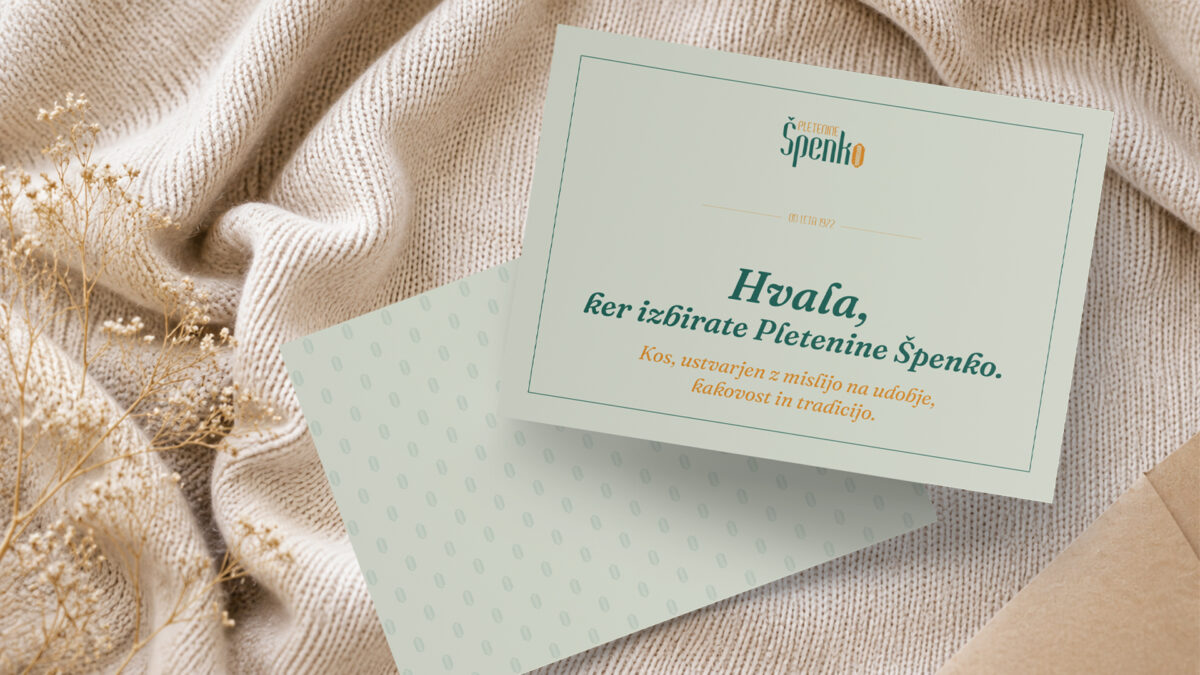
The identity was also applied to customer-facing print details, including a price tag and thank-you card. These pieces use the softer color palette, refined typography, and background pattern to create a warmer and more personal brand experience. Rather than feeling purely functional, the printed materials become small touchpoints that reinforce quality, care, and the handmade character of the products.
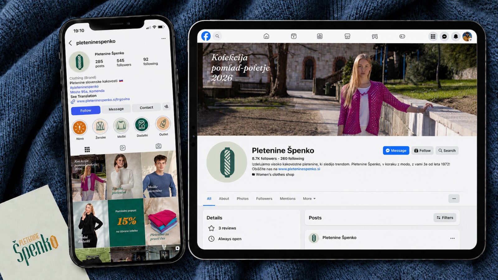
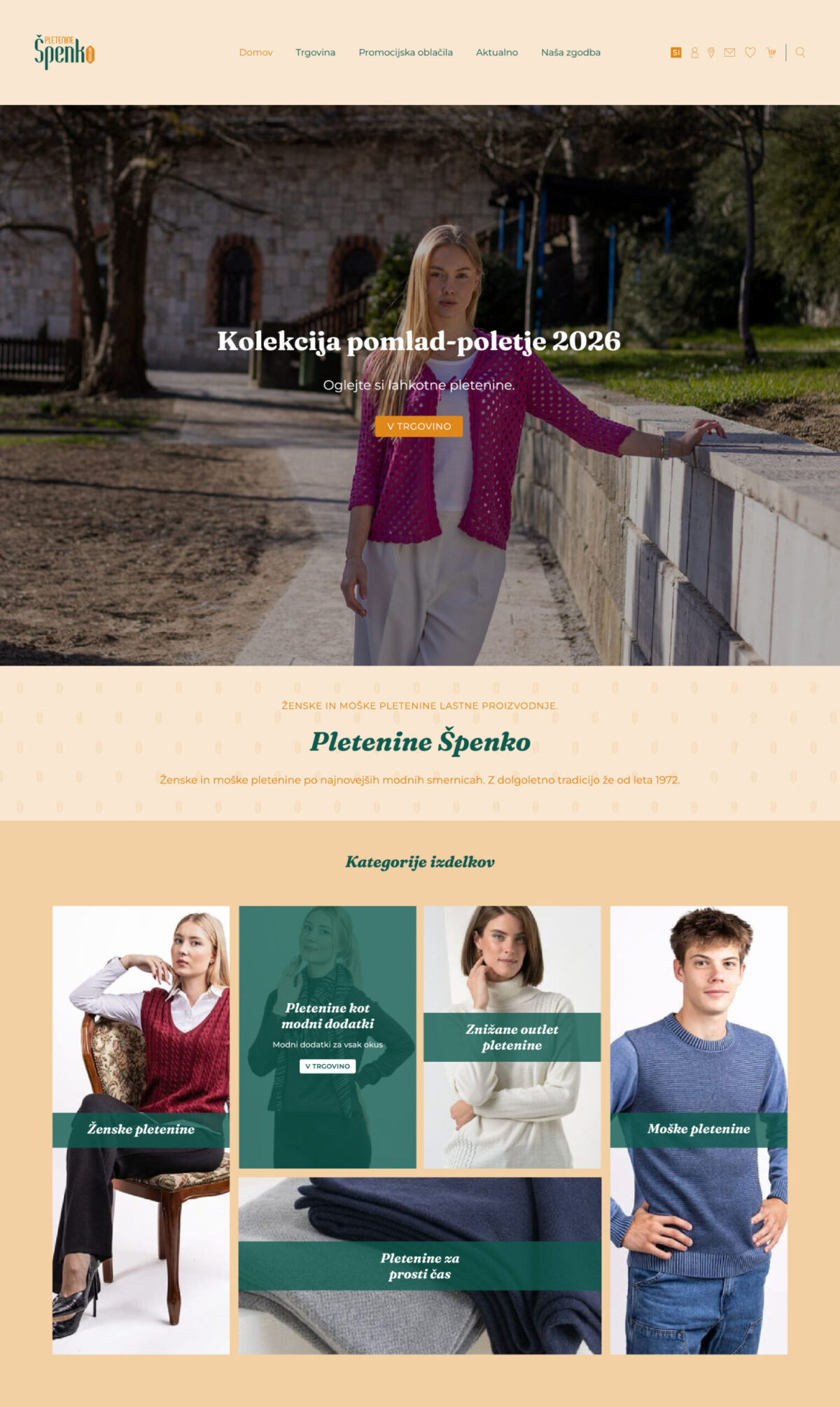
For the digital side of the brand, the system was translated into a refined website direction and social media presence. The website concept introduces a softer visual atmosphere through cream backgrounds, muted green and ochre accents, product-focused category blocks, and a more cohesive use of typography. The redesigned Instagram and Facebook profiles show how the identity could support seasonal communication, product highlights, promotions, and brand storytelling in a more consistent and recognizable way.
Together, these applications show how a primarily logo-focused redesign can grow into a broader visual system — one that supports both physical product details and the brand’s online presence, while keeping the tone warm, textile-driven, and connected to tradition.
The redesigned identity was extended across a focused set of brand applications connected to product presentation, customer experience, and digital communication. On clothing labels and apparel tags, the new logo gives the brand a more crafted and professional presence, while the yarn-inspired logomark works as a small but recognizable detail. The tag system combines the full logo, subtle pattern, warm paper textures, and heritage messaging such as “Od leta 1972,” helping connect the products with the brand’s long-standing tradition.
The identity was also applied to customer-facing print details, including a price tag and thank-you card. These pieces use the softer color palette, refined typography, and background pattern to create a warmer and more personal brand experience. Rather than feeling purely functional, the printed materials become small touchpoints that reinforce quality, care, and the handmade character of the products.
For the digital side of the brand, the system was translated into a refined website direction and social media presence. The website concept introduces a softer visual atmosphere through cream backgrounds, muted green and ochre accents, product-focused category blocks, and a more cohesive use of typography. The redesigned Instagram and Facebook profiles show how the identity could support seasonal communication, product highlights, promotions, and brand storytelling in a more consistent and recognizable way.
Together, these applications show how a primarily logo-focused redesign can grow into a broader visual system — one that supports both physical product details and the brand’s online presence, while keeping the tone warm, textile-driven, and connected to tradition.
OUTCOME
The final identity gives Špenko knitwear a more polished and recognizable visual presence. The redesign keeps a connection to the brand’s craft and traditional character, but presents it through a cleaner, more professional system.
The new logo feels more appropriate for an established knitwear brand: warm, tactile, slightly vintage, yet modern enough to function across contemporary brand touchpoints. The yarn-based “O” adds memorability and flexibility, giving the brand a distinctive visual asset that can be used beyond the main logo as a standalone mark.