Mediteranika
Visual identity for a green roofing company inspired by Mediterranean light, vegetation, and the connection between architecture and nature.
Services: brand identity / logo design / business cards / stationery / billboard signage
PROJECT OVERVIEW
Mediteranika is a visual identity project for a company specialized in installing green roofs on private houses and residential buildings. The service connects architecture, sustainability, vegetation, and better use of outdoor living surfaces — turning roofs into functional, natural, and visually softer spaces.
The client wanted the identity to feel connected to the Mediterranean, but without relying on overly literal or decorative coastal clichés. The brand needed to communicate freshness, warmth, natural growth, and a sense of professional reliability.
The final identity combines a clean typographic logo with a simple sun symbol, a turquoise-yellow color palette, and subtle leaf-inspired graphic details. Together, these elements create a visual language that feels bright, natural, and approachable, while still remaining structured enough for professional communication.
CHALLENGE
The main challenge was to create an identity that could balance two different sides of the brand. On one side, Mediteranika needed to express nature, vegetation, freshness, and the ecological value of green roofs. On the other, the company also needed to feel credible and professional, since the service is connected to construction, installation, technical planning, and long-term investment in a home.
Another important part of the challenge was the Mediterranean direction. The goal was not to create a typical tourist-inspired or seaside visual identity, but to translate the feeling of Mediterranean light, warmth, greenery, and outdoor living into a more refined brand system.
Because green roofing is a service that many people may not immediately understand, the identity also had to be clear and accessible. It needed to make the company feel trustworthy and easy to approach, while giving the brand a distinctive visual presence.
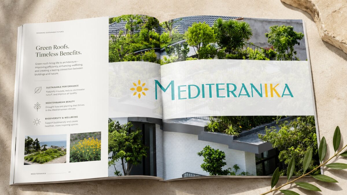
The concept is based on the relationship between sun, vegetation, and the built environment. Green roofs depend on living surfaces, natural growth, and exposure to light, so the identity uses these elements as the foundation of its visual language.
The sun symbol introduces warmth and a clear Mediterranean association. It gives the logo a friendly and optimistic character without becoming too illustrative. The leaf motif adds a more direct connection to vegetation, growth, and the ecological aspect of the service.
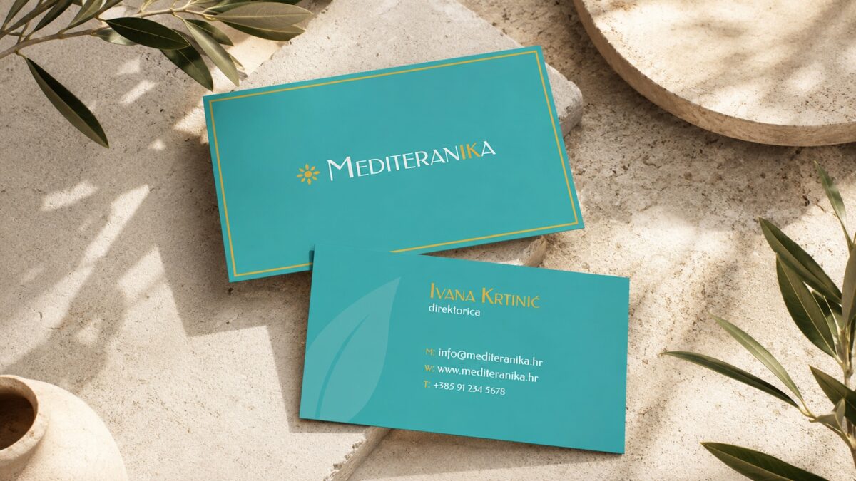
A subtle personal detail is integrated into the wordmark through the highlighted letters I and K in the name Mediteranika. These letters represent the initials of the company owner, adding a quiet signature-like element to the identity. Instead of separating the personal reference from the brand, the initials are built directly into the logo, making the mark feel more connected to the person behind the business.


The concept is based on the relationship between sun, vegetation, and the built environment. Green roofs depend on living surfaces, natural growth, and exposure to light, so the identity uses these elements as the foundation of its visual language.
The sun symbol introduces warmth and a clear Mediterranean association. It gives the logo a friendly and optimistic character without becoming too illustrative. The leaf motif adds a more direct connection to vegetation, growth, and the ecological aspect of the service.
A subtle personal detail is integrated into the wordmark through the highlighted letters I and K in the name Mediteranika. These letters represent the initials of the company owner, adding a quiet signature-like element to the identity. Instead of separating the personal reference from the brand, the initials are built directly into the logo, making the mark feel more connected to the person behind the business.
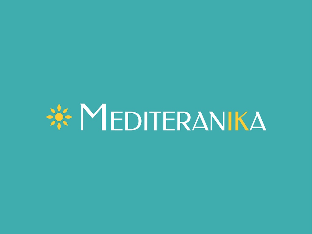
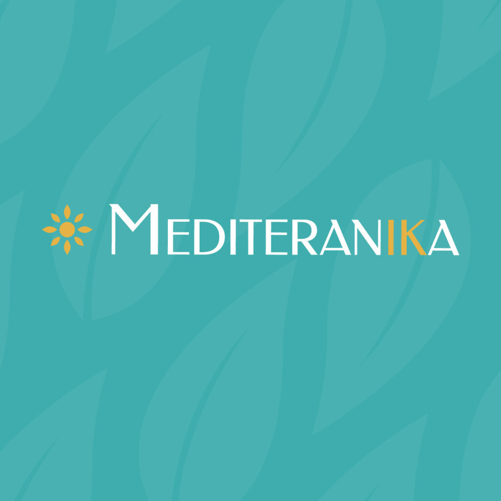
The visual identity is built around a simple logo lockup, combining a stylized sun symbol with a clean wordmark. The wordmark uses thin, elegant letterforms that give the brand a lighter and more sophisticated character, while the sun icon works as a recognizable supporting mark across different applications.
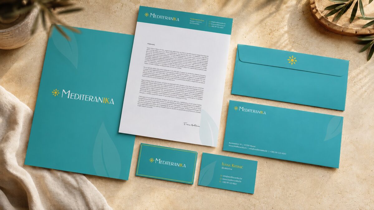
A turquoise base color defines the identity and gives the brand its most distinctive visual cue. It creates a fresh, open, and slightly coastal impression, while still feeling modern and usable across business materials. Yellow is used as a secondary accent, mainly through the sun symbol and selected typographic details, adding warmth and contrast.
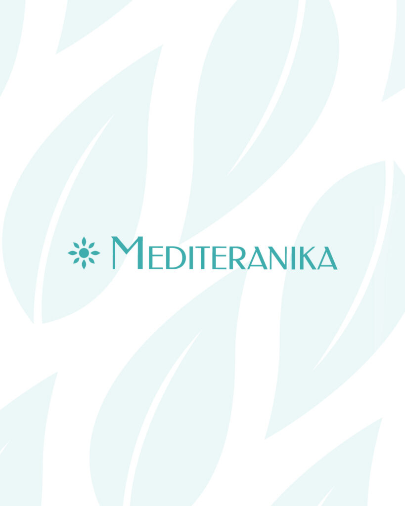
Subtle leaf graphics are introduced as a supporting visual element. These are used in a low-contrast way, almost like a background texture, so they do not compete with the logo or typography. Their role is to bring a softer organic layer into the system and strengthen the connection to vegetation.
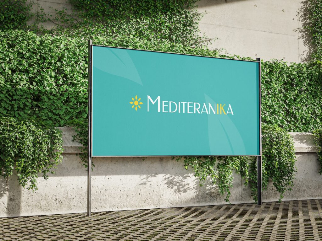
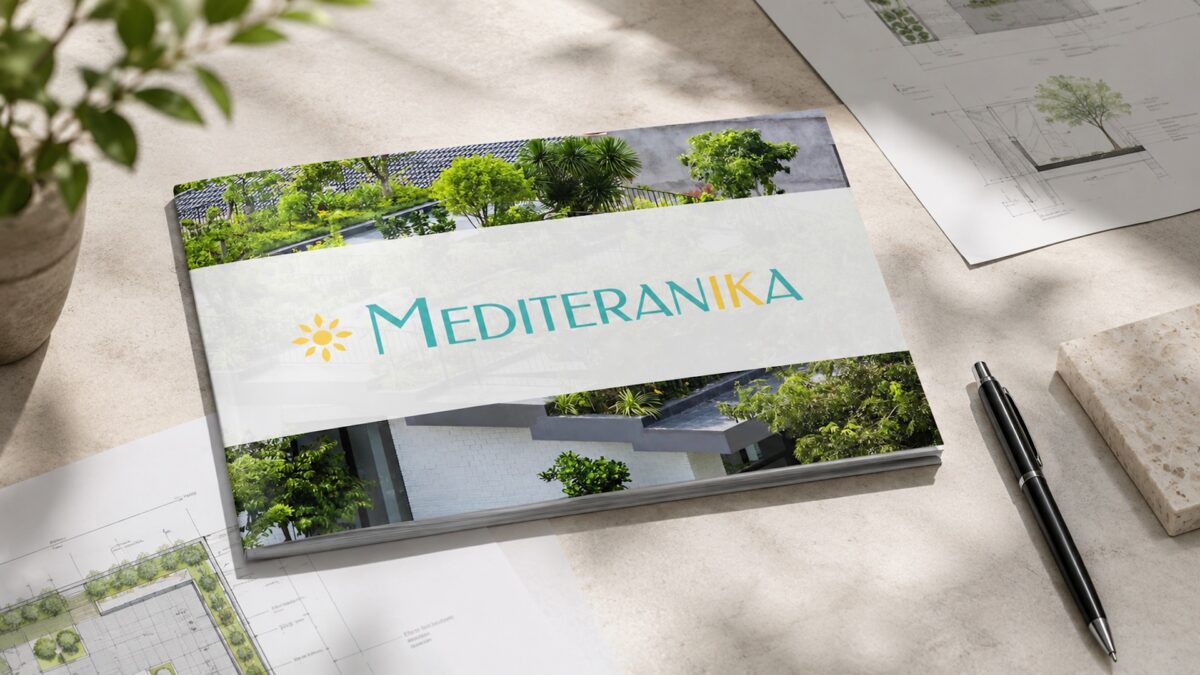
The identity was applied across a focused set of materials, including business cards, stationery, and billboard signage. Each application was designed to carry the same visual atmosphere through a combination of turquoise surfaces, elegant typography, warm yellow accents, and subtle leaf-inspired details.
Across both print and signage, the system remains clean, consistent, and easy to recognize. The smaller brand materials support a professional everyday presence, while the billboard application gives the identity stronger visibility in space. Together, these touchpoints help Mediteranika communicate a brand that feels fresh, approachable, and closely connected to nature and Mediterranean character.
OUTCOME
The final visual identity gives Mediteranika a clear and recognizable brand presence that connects green roofing with a warm Mediterranean sensibility. It communicates nature, sunlight, freshness, and professional care without becoming overly decorative or informal.
The system gives the company a complete and consistent foundation for communication, from small printed materials to outdoor signage. Through the use of turquoise, yellow, sun symbolism, and organic leaf details, the identity positions Mediteranika as a service that brings more life, light, and greenery into residential architecture.
The result is a brand identity that feels approachable, optimistic, and visually distinctive — supporting the idea of green roofs not only as a technical solution, but as a more natural and pleasant way to experience the home environment.